|
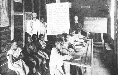
Structured Dissonance and the Art of Building Arguments for the World-Wide Web by Sean D. Williams My goal as a writing teacher is to help students learn how to impact their worlds through effective and persuasive representation of knowledge. In the late 20th century this means electronic technology must be integrated into my classes since, as Americans, our lives are so complexly intertwined with computers, most recently with the World Wide Web, that students need to possess the skills necessary to manipulate the whole diversity of media implied by the term "digital literacy" to be effective communicators, not just skill in producing printed documents. Therefore, if our goal as writing teachers is to help students impact their worlds through effective and persuasive communication, then we need to teach them how to do so in ways that are current. In short, we need to teach "electronic argumentation." "Electronic argumentation" is more than a sophisticated way of saying that our students need to learn HTML and how to put their papers on the Web with a few links to a "Works Cited." In order to help us understand what electronic argumentation means, I would like to address one fundamental question: "What are the special qualities of hypertext as experienced on the World Wide Web (WWW) for conducting argumentation?" My answer: "structured dissonance." I admit this might seem like a paradox at the moment - for how can something be both structured and dissonant at the same time - but in fact, as I hope to show in what follows, the particular quality of electronic argumentation in its WWW embodiment does exactly that. That is, WWW designers use structured dissonance to make claims on the user. Groundwork Although I hinted above at why a theory of electronic argumentation is necessary, I didn't fully engage the question of why we should care about moving argumentation into an electronic medium, specifically the WWW. Two reasons stand out. First, we are quickly moving from a print culture to an electronic one. The second, and perhaps more persuasive reason derives from a question Stuart Moulthroup asked in "Beyond the Electronic Book: A Crtique of Hypertext Rhetoric:" how should rhetoricians position themselves, as advocates of an endangered literacy or as pathfinders for new modes of communication and argumentation (292)? The first of these two premises implies that a rift has developed between understanding writing as a stable, conservative picture of rationality and writing as part of a complex of intertexuality. Richard Lanham in his book The Electronic Word: Democracy, Technology and the Arts, characterizes the issue best when he says that the tradition begun by Greek philosophy which continued through the empiricism of Bacon and Descartes until the 20th century, is based upon the belief that we can look THROUGH a text to reality rather than looking AT the text itself(5-9). And as Jay David Bolter notes in Writing Space: The Computer, Hypertext, and the History of Writing, unlike print, hypertext is not characterized by a notion of stability and independence, but invests much more in the dynamic interaction between texts, between authors, between reader and writer, and all of the above in the construction of meaning (114-19). That is not to say that "writing," is going away because clearly it is not. But the way that our society defines writing has begun to reflect a type of networked interdependence characteristic of hypertext. This shift has profound implications for persuasive writing because as Stuart Moulthroup and Nancy Kaplan suggest in "They Became What They Beheld," to work in a medium is to express that medium's particular message. Printed media leads to the linear, singular, stable progression of understanding and therefore printed arguments must reflect that way of knowing (235-36). On the other hand, working in hypertext more closely resembles conversation's cooperation, extension, and local modification, revealing that digital media promotes interactivity and instability. In short, the way we think is beginning to change because the way we represent knowledge in writing is beginning to change. Stuart Moulthroup's question, the second point in defense of why we need a theory of electronic argumentation, deserves to be repeated because it telegraphs the fundamental question writing teachers must ask themselves about this transition from print culture to digital culture. He asks "Do rhetoricians see themselves as advocates of an endangered literacy or as pathfinders for new modes of communication" (292)? I suspect my answer is clear: rhetoricians need to teach ways of building arguments with technology that reflect this newly emerging digital literacy. Some introductory notes on this new mode of communication are, therefore, necessary here since my theory of electronic argumentation is based on the premise that some clearly identifiable thing we could call "digital literacy" actually exists. Writers in computers and communication have offered many characterizations of digital literacy, each of which contributes a piece to forming a more coherent picture of the whole. For example, Delaney and Landow argue in "The Digital Word" that as all texts become digital, the idea of composition will expand to include the interweaving of visual, aural and verbal meanings (5). Lanham calls this interweaving "digital equivalency" (11) and Gilster calls it "digital convergence" (31), but the point is the same: because everything that we compose and "read" on a computer evolves from the same binary swamp of 1's and 0's, these formerly discreet media can be merged into a single document, just as they have in the document you are currently reading. Or in George Landow's words from "The Rhetoric of Hypertext: Some Rules for Authors," "as our notions of text change, so must our means of composing it" (102). But if our means of producing text must change, so must our means of consuming it and as Deborah Brandt suggests, digital literacy also requires the ability to negotiate the surplus of digital information and the literacies that emerge from them (666). Likewise, William Costanzo argues in "Reading, Writing and Thinking in an Age of Electronic Literacy" that reading an electronic text is "like moving through a three dimensional world of language. With hypermedia, this world stretches even further to accommodate the languages of graphics, music and motion pictures. The sites of literacy expand beyond the flat map of the page." (13). Costanzo and Brandt are suggesting that if an electronic text demonstrates "digital convergence" or the interweaving of formerly discrete media and literacies into a single document, then reading it - or rather experiencing it - requires the same ability to grasp the complex interplay of sign systems to form a single text even though that specific piece may be characterized by a high degree of fragmentation. Each of these characterizations converge at one point best summarized by Paul Gilster in his 1997 book, Digital Literacy. Digital literacy is "the ability to understand and use information in multiple formats from a wide range of sources when it is presented via computers" (33). This definition of digital literacy lies at the center of "electronic argumentation," specifically arguments built for the WWW using the principle of "structured dissonance." Structured Dissonance "Structured Dissonance" admittedly seems to be a paradoxical and vague way to frame the central concept in electronic argumentation. However, when its two constituent terms, "structured" and "dissonance," are analyzed separately, it becomes apparent that only an elastic term can simultaneously contain the complexity of the separate parts while allowing them to complement each other as one argumentative structure. Dissonance To begin with the second aspect of this structure, Webster's New Collegiate Dictionary defines "dissonance" as "lack of agreement; inconsistency between actions, words or beliefs; a clashing of unresolved sounds; discordance; incongruity." The definition itself seems dissonant since this one word can simultaneously refer to actions, words, sounds or people. "Dissonance," as it works in electronic argument, reflects this multiplicity because in digital media at least three types of dissonance, verbal, visual and cognitive, converge to force the user, like the computer, to perform multiple calculations simultaneously. Unlike a computer, however, the calculations that we as humans perform do not use the same "language" and so verbal dissonance relies on linear and conceptual disjunctions; visual dissonance relies on relational and perceptual disjunctions; and cognitive dissonance brings these two languages together forcing us as users to process often conflicting representations of the same problem. The result is that multimedia hypertexts, more than any type of singular media, allow - and utilize for rhetorical effect - dissonance. Verbal dissonance is not a new concept, nor is it unique to hypertext. However, as George Landow notes in Hypertext 2.0: The Convergence of Critical Theory and Technology, hypertext might be the best example of verbal dissonance because it quite literally embodies the postmodern textual theories which suggest that texts are transient, decentered, boundless, contextual, and are always involved in networks of textuality (32). To give a well-worn example, when Queen Elizabeth II utters the sentence, "It's cold in here," how do we account for the fact that a servant will go to the window and close it since there is no mention of a window and the servant is not directly addressed? One explanation offered by Speech Act theorists like John Austin is that sentences can carry an "illocutionary force" or that they can "do" something, in this case give an order to close the window without explicitly articulating that request. Critical linguists, on the other hand, suggest that in this situation the queen enacts her power implicitly and to do so explicitly would undermine the presupposition or her authority. In either case, understanding the meaning of the utterance relies upon the queen's participation in a network of relationships, textual and social, and the servant's recognition of the disjunction between his role in that network and the queen's. I could cite Bakhtin, Derrida, Barthes, Foucault, and virtually all critical linguists here, essentially rehashing 30 years of critical theory and work in applied linguistics, but I think that Stuart Moulthrop summarized verbal dissonance well when he wrote in "Beyond the Electronic Book" that understanding a text means becoming radically aware of the latent disjunctions and contingent discourses present in any given discourse (216). In other words, no word, phrase or sentence in a text, hyper- or otherwise, exists apart from a complicated network of often contradictory social relationships and contexts which ascribe meaning to those words. This has profound implications for electronic argumentation on the WWW because the readily available multiplicity forces us, recalling Lanham, to look AT the text and then THROUGH it. That is, in hypertext we do not immediately comprehend meaning, or look THROUGH a text, because we must explicitly re-structure how the text participates in a series of relationships - "Why did that link lead here?" - for comprehension to occur. Again, this is not a new skill because whenever we read, we essentially do the same thing. The point is that in hypertext, we are forced to recognize the verbal dissonance because one can see the lack of agreement between my verbal representation of a problem and somebody else's by a simple point and click. In Hypertext 2.0, Landow lauds this type of knowledge representation, claiming that it seems more honest because "the text of the Other may butt up against that by someone else; it may even crash against it" (171). Two or more verbal representations can exist simultaneously here and are quite possibly inconsistent with each another, but they still exist in the same network of textuality by virtue of the links among them. Visuals can be dissonant in much the same way. As Jacqueline Glasgow notes in her article "Teaching Visual Literacy for the 21st Century," "We live in an age of visual messages...and these messages can be assaulting, seducing, or merely intruding" (494). The power that they have, Glasgow suggests, derives largely from the disjunction between visible features and cultural themes, between the surface text and the socio-cultural text (498). Kress and Van Leeuwen in their book, Reading Images: The Grammar of Visual Design make much the same point, arguing that visuals often have, internal to themselves, competing surface and social codes. They make the case by contrasting pictures taken from a frontal angle and those taken at an oblique angle. They argue that if a photograph has a frontal angle, that is, we as viewers look directly into the eyes of those who are being photographed, it implies a level of involvement with the visual subject. Perhaps the most common occurrence of this technique is portrait photography: who, after all, would hang a portrait of a stranger above the fireplace? On the other hand, an oblique angle does not allow connections between viewer and subject. In Kress and Van Leeuwen's words, the oblique angle says "what you see here is not part of our world; it is their world, something we are not involved with" (143).
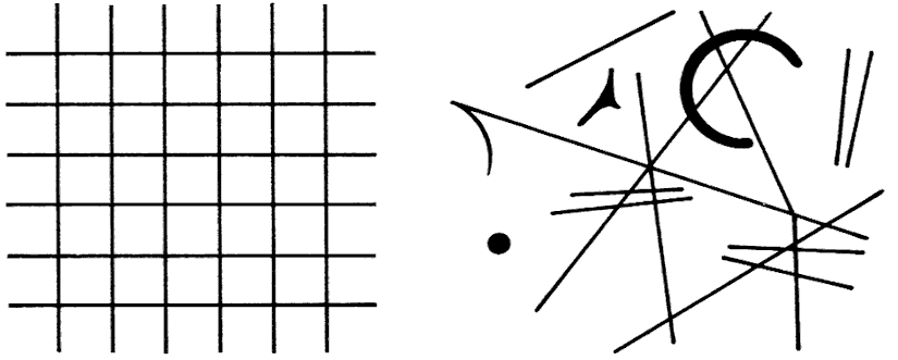
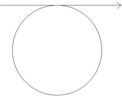
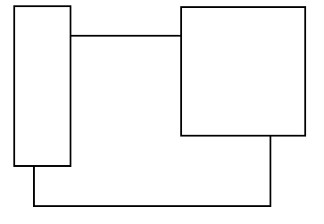
In the image to the right (Figure 1) which I have reproduced from Kress and Van Leeuwen's book the two white teachers and their instructional materials are shown as part of "our" world because they face the camera, while the Aborigines are "others." Donis Dondis similarly argues in his A Primer of Visual Literacy that the very dissonance between expectations about the way visuals should appear and the way they actually do appear contributes to their persuasive force. Dondis calls this force "stress", but the point is that complexity, instability, irregularity attract the eye and "in simple terms, the visual elements that are placed in areas of stress have more weight" (30). For example, compare the images below in Figure 2 which Dondis uses to demonstrate this concept:
The figure on the left represents balance and regularity since both the horizontal and vertical axes are perfectly symmetrical. Dondis calles this "repose." The figure on the right, by contrast, creates stress because it usurps expectations of balance and symmetry and therefore requires more of the viewer's attention. Dondis suggests that utilizing visuals in this way to work against expectations "is the most effective of all visual means in creating an effect in response to message purpose" (25). Although the categories that Dondis specifies, such as "economy," "unity," "balance," "symmetry," and "predictability," gloss the fact that these are most likely virtues of visual representation in the western world and may not be universal, the concept remains the same: visual dissonance occurs when designers create ruptures between expectations and realizations. This returns us to Lanham's notion of looking AT a text versus looking THROUGH a text. Visual dissonance, either internal to a specific image such as that in the photo taken from Kress and Van Leeuwen, or that created by the juxtaposition of two images, such as those taken from Dondis, forces us to look AT the structure of the visual before looking THROUGH it in an attempt to ascribe meaning. In hypertext, not only does the possibility exist for a visual to be internally dissonant, but the possibility also exists for a user to readily compare the incongruities among several visuals with a simple click. Cognitive
dissonance (a phrase coined by cognitive psychologist Leon Festinger), the clashing of
visual and verbal representations, is perhaps the easiest form of dissonance to recognize
on the World Wide Web, but is probably the most complex because in order to create it,
designers weave together verbal dissonance and visual dissonance. In a March 1998 article,
Tom Williams and Deborah Harkus explain that verbal texts and visual forms convey
information in substantially different ways and are therefore suited for different tasks.
They identify four criteria that differentiate pictures from text: 1. differences in how symbols in each system evoke their referents; 2. differences in the nature of the referent they evoke; 3. differences in the structure each symbol system imposes on the
information it carries; 4. differences in the degree to which information carried in either
system can be processed perceptually (34). First, each system evokes their referents differently. Words are
arbitrary signs that speakers of a language have agreed stand for something. There is
nothing in the word "sphere," to use Williams and Harkus's example, that
suggests something round. A photograph of a sphere however, evokes its referent by
resemblance: the thing in a photograph of a basketball resembles a sphere. Second, words
typically evoke categories while visuals evoke more specific things. To return to the
example of the word "sphere," writing this word refers to an entire class of
things that have certain properties such as roundness. However, a picture of a basketball
virtually excludes any reference to tennis balls because a picture by itself has a
difficult time suggesting anything conceptual such as "sports equipment." Third,
text is linear and visuals are relational. Text processing, according to cognitive
psychologists such as Williams, occurs by understanding how a text is asking you to
reconstitute the relationships among the ideas it presents. This "metadiscourse"
relies on a reader's ability to place certain ideas in specific places as subjects or
objects, for example. Visuals, by contrast, do not rely on linear progression and can,
therefore, represent a more complex view of the relationships among ideas. Last, words
cannot be understood perceptually and visuals can. Words and sentences require that we
combine several visual elements into a single letter form, then we combine those letter
forms into words, then into sentences. This process requires a good deal of conscious
attention to make meaning. Visuals, by contrast, can be processed
"pre-attentively" meaning that when we look at something, we immediately see
patterns, colors and contours which suggests that several processes are occurring
simultaneously. In short, words require linear thinking and promote hierarchical habits of
mind; visuals require relational thinking and promote thinking that identifies patterns
and relationships (Williams and Harkus 34-35). I have dwelled so long on the difference between verbal texts and
visual texts for one reason: the World Wide Web relies as much on the visual as on the
verbal. This has significant implications for building electronic arguments on the WWW
because it means that users have to negotiate the incongruity of clashing symbol systems
while processing the individual dissonance of a single verbal or visual message and
evaluating that knowledge against previously encountered representations, whether verbal
or visual. Dissonance, then, works argumentatively by forcing users to re-evaluate their
singular knowledge or beliefs or interpretations against a continually developing frame of
reference which defies and complicates singularity, implicitly arguing for the
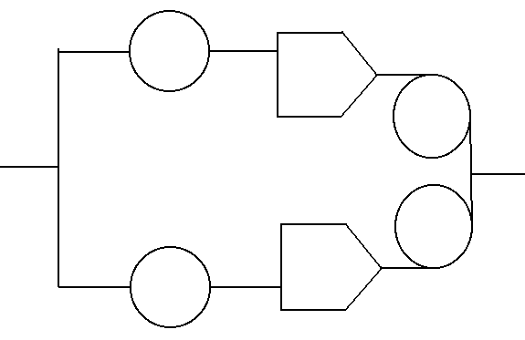
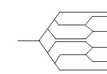
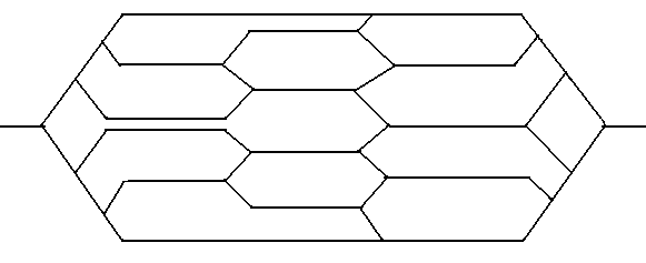
"reality" of multiple perspective on any issue. Structure Although the WWW, through dissonance, always makes the implicit claim that multiplicity is the "real" character of any idea, belief or issue, the structure a designer creates limits the possibilities of dissonance by representing only a circumscribed set of "truths." Hypertext scholarship, specifically that concerned with the web, rarely addresses how designers limit representation on the WWW by manipulating structure, specifically a site's global structure formed by URLs and its local, sequential structure formed by links within a site. Mark Bernstein, in his paper, "Patterns of Hypertext," delivered at the "Hypertext '98" conference, offers perhaps the first sustained commentary on global structure. In the essay, Bernstein describes ten types of sites: cycle, counterpoint, mirrorworld, tangle, sieve, montage, split/join, neighborhood, missing link and feint (in press). Bernstein's taxonomy proves valuable because he describes how each form contains and guides user experiences (I have reproduced seven of his visual representations below). For example, "Where counterpoint (Figure 3) interweaves different voices of equal (or nearly equal) weight within a single exposition,
the mirrorworld (Figure 4) establishes a second voice that separately parallels (or parodies) the main statement" (in press).
The "Sieve" (Figure 5) and the "Split/Join" (Figure 6) explicitly guide a user's path because each of these two structures actually sort users allowing them to experience different episodes or points of view. The split/join, however, might be misleading in the diversity of viewpoints represented because no matter which path a user takes through the landscape, the exit is always the same. Bernstein also suggests that each structure suits different rhetorical purposes, so argumentation, for example, utilizes a "cycle," (Figure 7) by repeating points or
modifying them, and a "tangle" (Figure 8) might disorient users "in order to make them more receptive to a new argument or an unexpected conclusion" (in press).
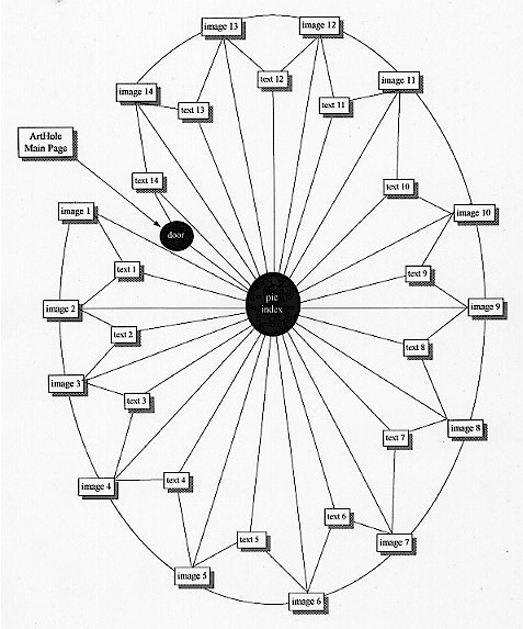
Macro-structure, then, governs how problems are represented, since a "montage," for example (Figure 9), requires multiple writing spaces to appear at the same time and the fact the multiple spaces must appear determines how a user can view information. The same is true of all Bernstein's structures: the form determines the presentation of content. "Structure," however, focuses not only on the shape of an electronic argument, but also on its progression which the designer also creates. That is, as Peter Andersen argues in "Towards an Aesthetics of Hypertext Systems," the paths that the designer provides through linking are largely responsible for representing the purpose of the text and that the most rhetorically effective structures in hypertext consciously create patterns that help the reader recognize and restructure an argument much like the linguistic cues which structure written arguments (227). Past commentary on link structure has focused primarily on using structure to efficiently present information, virtually ignoring the persuasive nature which ordering presentations and connecting documents implies. Steven J. DeRose, for example, in "Expanding the Notion of Links" taxonomizes links as either "Extensional" or "Intensional" and argues that greater emphasis should be placed on the latter because they provide for more efficient data retrieval (251). Intensional links, according to DeRose, connect specific words or ideas in the text to other texts such as editor's notes which are most often internal to the present document (254). DeRose's discussion, however, overlooks the rhetorical aspect of links which order the presentation of content in such a way as to render it persuasive: what qualifies as "efficient" or "effective" for DeRose is actually a designer presenting information in such a way that the user can readily recognize the connection between two points and assent that the relationship is meaningful. The first article, to my knowledge, to explicitly address links' rhetorical function is Nichalos C. Burbules' "Rhetorics of the Web: Hyperreading and Critical Literacy." He writes, "The use and placement of links is one of the vital ways in which the tacit assumptions and values of the designer/author are manifested - yet they are rarely considered as such" (105). Links, as Burbules correctly notes here, express specific argumentative intentions by subtly guiding users to recognize or intuit the connection between specific pages on a website: users must ask themselves "what is the implied meaning that the juxtaposition of two pages connected through a link suggests?" Users may not be so articulate in expressing how they make meaning, but as Burbules parenthetically suggests, a jump from a page on teenage drug-use statistics to a page on rock music certainly implies something about both topics (105). A link certainly may not be interpreted as the designer wishes all the time, but the fact remains that a link suggests connections and patterns of thinking by defining a fixed set of relations in a circumscribed order which tacitly argue for a particular interpretation of a problem or issue. Since both structure and dissonance characterize hypertext, a designer must effectively manipulate their interaction in order to create a persuasive electronic text. Designers accomplish this by allowing users freedom of choice in navigating the space, creating the illusion that users are forging their own paths and representations. However, in reality, at any given point, based upon the links a user travelled to arrive at the current location, a designer makes choices available, but only a subset of those possible. Users traverse the landscape and as they become familiar with it, the dissonance of competing representations and conflicting paths begins to dissolve into patterns. Users create an associative map of the area - how this relates to that - but in fact, they do not create the map at all because the very fact that they recognize the link between this idea or representation and that one derives from the link structure of the hypertext which a designer created: the dissonance is structured by the user, but according to designer-determined limitations which effectively argue for particular interpretations by circumscribing choice. A Demonstration of Structured Dissonance: "Chicago Murder Sites" "Chicago Murder Sites" (http://arthole.com/cms), designed by a fairly well-known graphic artist named Harlan Wallach, demonstrates the theory of structured dissonance particularly well. In this website, which combines stylized black and white photography of what one presumes to be murder scenes with what appear to be newspaper clippings about the murders that took place at those scenes, Wallach utilizes a spider web-like version of Bernstein's "cycle," to structure dissonance. Further, although Wallach does not offer any explicit claims about the death of truth or brutality of murder or that the world is fragmented and unnatural or that the black and white of right and wrong can be skewed to justify any perspective, he does effectively utilize structured dissonance to force users to recognize that each of these propositions might be true, that they are all valid interpretations of the "reality" represented in this site. Structure Forget all conceptions about the Internet as a web. It's a labyrinth: a nearly infinite capillary-like structure where a user could continue to go forward but would never arrive anywhere - and this endless motion is the point. A web structure, however, like that demonstrated by CMS, is organic and hermetic (Figure 10, below).
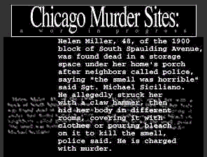
It is a small, self-contained, yet extremely intricate oasis of meaning in the swelter of 300 million users going every which way. The virtue of this structure for argumentation, like the webs that spiders weave, is that once users are in, they cannot get out: they are confronted with a compact experience that builds on a central, designer-determined theme and no matter where they go in the site, claims are being made even if they cannot be articulated. For this reason, the web structure, like the one Wallach used to create CMS, suits electronic arguments best. When I first discovered "Chicago Murder Sites," I travelled around it hoping to discover a narrative as I moved from image 1 to image 14 occasionally glancing at the accompanying texts. I did not find one, so I set out to map the site intent on discovering the hierarchy and hopefully finding my meaning among the subordination. I failed. This site confounded all my attempts to draw complicated tree structures because so much cross-linking occurred. However, when represented as Bernstein's "cycle" with the "pic index" at the center and the texts and images surrounding it like spokes, the site demonstrates a very clear structure. One can travel from image to image, from image to text to image, or from image to text to the index to another image represented in Figure 10 above by the lines between lexia. When each of the links are combined and represented in a single image as in Figure 10, it is easy to see that the topographical structure of CMS very closely resembles Bernstein's "cycle" because users are directed through the site where "measured and planned repetition can reinforce the writer's message (Bernstein, in press), which in this case revolves around the representation of murder scenes. "Chicago Murder Sites" diverges from Bernstein's cycle, though, in one very important way that perhaps qualifies it as another unique structure. According to Bernstein, a user traversing a cycle either returns to the starting point after completing the cycle and continues in another direction or, as in the case of a "web ring" (a group of related but autonomous cycles), leaves one cycle to travel through another. CMS, by contrast, does not allow users a way out. When one comes to text 14, the last page in the site, whether by following the numerical progression or not, there are two choices: return to the front door, or return to the pic index (refer to Figure 10 above). The result is that unless users manually type in a new URL or tap the "back" button on their browsers and travel their path in reverse, they are trapped within CMS because there are no external links from within the site. I attempted to represent this by the one way arrow from the ArtHole Main Page into the front door in Figure 10. This is not a two-way link. Once a user moves beyond the first entry through the front door, there is no way back. Further, despite the apparent freedom to travel among images texts, and the index, Wallach, as designer of this site has limited possible paths by not allowing users to move between text pages. That is, one may go from Image 1 to Text 1 to Image 2, but may not travel from Text 1 to Text 2. A user might also choose to go from Image 1 to Text 1 to the Index to Image 7, but may not travel from Text 1 to the Index to Text 7. The result is that no matter how users choose to navigate "Chicago Murder Sites," they must confront an image of a murder site. Wallach clearly structures how a user interacts with his site. One may see any of the images by travelling through the Index across the web, but because the link structure limits access to the text pages, users are forced to make a connection between a specific image and a specific text regardless of whether or not they can readily be related. For example, when comparing Image 14 and Text 14 below (Figures 11 and 12),
one notices that despite the text's claim that the woman was found under her porch, the house in the image does not even have a porch visible. So although users can create their own path through this space, that path is available because Wallach chose to build a structure which in effect coerces users into forging connections between specific images and specific texts regardless of how closely the representation in one medium resembles or explains the other representation.
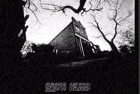
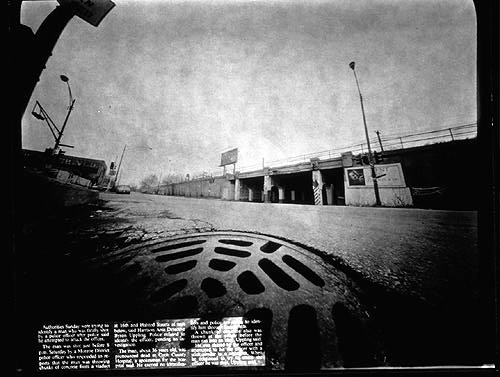
Dissonance Every print on CMS is black and white. The black and white images suggest that these are not intended to be "natural" representations of crime scenes, but abstracted, conceptual ones, and in the western world, abstracted concepts usually equate to scientific knowledge which is presumed to be "reality." Or in the language of reality, mathematics: abstract=scientific=reality. Black and white images, then, especially photographic images, are believed to be true because they are supposedly abstracted from the stifling and confusing emotional affects associated with coloration (although this might be changing since most newspapers now print color photography). Kress and Van Leeuwen agree, arguing in Reading Images that "abstract coding orientations" are used by "high art" or in academic and scientific contexts and the ability to read or interpret this coding orientation is a mark of social distinction, of being an "educated person" or "serious artist." Further, of all abstract coding, ones that are black and white carry the highest "modality," or truth content, in our society (170-71). In sum, by choosing to use black and white, Wallach is shouting "This is real! This is the way it is!" The way what is? Reality. Wallach moves from a very specific representation of a single murder site in black and white to what seems to be an objective statement that all we have left to represent in our culture is not even murder, but the empty streets where a murder once happened. Of course, the claim is not objective, but an interpretation of reality, a truth statement persuasively rendered through black and white photography and what in the visual arts has been called "the myth of detachment." For example, Image 1 (figure 13) positions the viewer as a
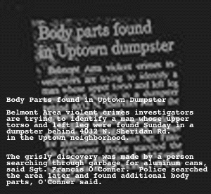
detached observer. Users are not asked to confront the glazed eyes of a bloody victim straight on, but instead see the murder site from the safety of distance and at an oblique angle displaced in time. According to Text 1 (see figure 16), parts of the murdered body were found in a dumpster, presumably one of the two against the building, and probably at some point in the past before the photograph was taken.
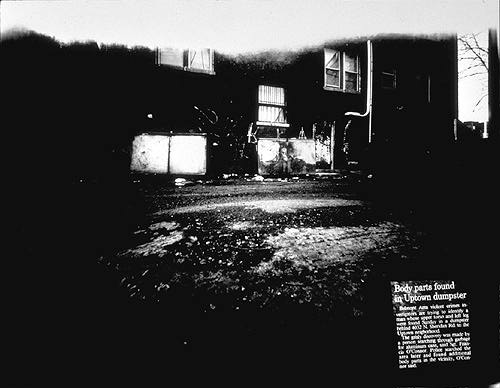
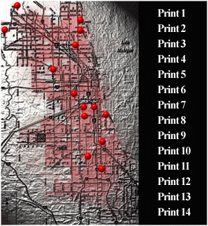
Notice, however, that in contrast to the Pic-Index, (Figure 14, right) where users look down from on high in an apparent God-like perspective, Image 1 positions users in the role of subservience, literally because the image places us, and figuratively because we are looking up. Notice also the windows in Image 1, especially the one on the right side with the curtain pulled aside. Is there somebody in that window looking down on us? We are not detached from this scene at all. We are quite possibly being observed, and the photograph's perspective is definitely positioning us, not allowing us to do the positioning. User expectations conflict with the realization: dissonance. But Image 1 is not alone in disrupting this presumption of detachment. Image 4 below (Figure 15) is perhaps the most powerful of all the prints in the series because it positions users as though we are prone on the ground, lying partially over a sewer grate. There is no doubt in Image 4 that we are powerless victims of the constructed scene.
So what's the point? Look at Picture 4 and ask yourself, "Where would I have to be to see this scene this way, and what sort of person would I have to be to occupy that space?" (Kress and Van Leeuwen 149). The answer is profound: you'd have to be lying on the street, in the sewer in a run-down part of Chicago with your vision pinpointing on something in the distance. You might be a murder victim, lying powerless on the ground watching the corners of your life fade into the blackness of death. The persuasive force of Images 1 and 4, then, resides in the uncomfortable dissonance between subjugating the viewer to a powerless, prostrate, position in a clearly skewed reality and user expectations that black and white photography is the mode most suited for detached, abstracted, unbiased proclamations about reality. The verbal text in "Chicago Murder Sites" works much the same way, exploiting the rupture between the expectation that print texts are reliable, "true" sources of information and the realization that these texts may be fictional accounts written by Wallach.
In fact, the texts themselves are not even text. They are .gif's - image files.More importantly, as Text 1 (figure 16, right) demonstrates, the texts are palimpsests, texts written over texts. Wallach has placed the image of what appears to be a blurred newspaper clipping about the specific murder under new type which presumably, but not definitely, describes the scene the same way, in the same words. The user is forced to trust that Wallach's translation is accurate because the words in the clipping are not clear, either on the image to the left, or where users first encounter it on the lower right of Image 1 (Refer to Figure 13 above). One also cannot say for sure if the "clippings" are in fact "true" at all since Wallach does not cite any source or include the names of the newspapers where these articles appeared. These written accounts of the murders, then, might be completely fabricated. Our first instinct as users is probably to trust that these accounts are both taken from actual newspapers and that Wallach's representation of the source text is accurate. However to recall Richard Lanham's important distinction between looking AT a text and looking THROUGH a text, that presumption of authenticity relies on users looking only AT the surface of the text. That is, the writing style of these accounts closely resembles that of actual newspaper articles. It records the events in short, passive sentences, includes an eye-catching headline, and cites very specific details. The written text appears to be a true account of a murder. But looking THROUGH the text, examining what can be verified by the text itself, proves little because the text cannot be validated either by the accompanying image or by referring to an external source such as the original newspaper article on a specific day. The result is that just as user expectations were usurped by the visual dissonance between expectations and realizations in the black and white photographs, the verbal texts exploit the gap between truth and fiction. Although the claims Wallach makes here cannot be readily articulated, it is clear that the dissonance forces users to examine the easy construction of truth: if black and white photographs are not detached representations of reality, and the texts about those photographs are not verifiable, singular TRUTH itself seems to be the victim that Wallach's site eulogizes since everything in "Chicago Murder Sites" might be true, but may not necessarily be so. David Kolb, in his important article, "Socrates in the Labyrinth," offers insight on the way that hypertexts, like CMS, make claims about what might be true, foreshadowing the fluid circumscription of structured dissonance. He writes:
In Kolb's understanding of electronic argumentation presented above, users are free to choose their paths and vantage points within a circumscribed problem space which he metaphorically describes as a landscape or terrain, implying that arguments occur in a defined space, but are de-centered within those spaces as users exercise their autonomy to navigate through information. I do not think that the "Chicago Murder Sites" could be summarized any better. Wallach's site forces users to confront multiple representations of murder both visually and textually, and claims acknowledgement that these representations might be the reality of who we are and where we live. Wallach has built a tight structure which confines users forcing us to "try on" the reality of cold murder sites in black and white. And as Kolb predicts, although I am not exactly sure whether the argument is - that you cannot get out of a fragmented, surreal world, or that crime is unnatural or that media and death share the same bed or that the black and white of right and wrong can be skewed to justify an individual perspective - I do know that the way Wallach has chosen to structure dissonance allows for the possibility that all of these claims about representation and murder in Chicago might be true. Conclusion or What Remains to be Said Harlan Wallach's "Chicago Murder Sites" is one of millions of websites on the Internet and it might not even represent the majority of websites because CMS seems to be "artistic" and not informational. However, to make the claim that strictly informational sites compose the bulk of the World Wide Web overlooks the increasing presence of personal, educational and most importantly, commercial websites. David Siegel, in his online article "The Balkanization of the Web," comments, for example, on what he calls the three rings of the WWW: information, exchange and entertainment ("Balkanization"). In a more scholarly discussion of the same topic, Todd Michael Ohl and Ward Mitchell Cates taxonomize websites as informational, entertainment, promotional and educational. "Informational" sites obviously provide information on a topic; "entertainment" sites are designed to provide amusement through stories or chat rooms, for example; "promotional" sites advertise products or services and attempt to enlarge the market presence of a particular organization and conduct commerce; "educational" sites facilitate learning by providing access to instructional materials (25). Most of the academic - and popular - debates about the WWW center in some way or another on one of these topics. For example, the bulk of George Landow's work straddles the line between informational and educational uses of the web, Michael Joyce and Stuart Moulthroup most often write about hypertext fiction and so fit between the entertainment and informational categories, David Siegel bases his entire web aesthetics on promotion, and finally, scholars like Cynthia Selfe argue for increased access to technology exactly because it can lead to more equitable learning situations. Despite their apparent differences in purpose or content, however, I would argue that these different types of sites all utilize structured dissonance (admittedly to a greater or lesser degree) to construct probable pictures of reality: structure contains the dissonance of multiple representations of reality which multimedia hypertexts create by allowing users the opportunity to see the same ideas from different angles and in different contexts. It seems not to matter whether the "reality" under discussion is Ford cars vs. Subaru cars, the nature of hypertext fiction, the World Wide Web itself or grammar. Fundamentally, in contrast to George Landow's claims that designers do not control their own hypertexts (Hypertext 2.0, 300-03), this means that designers control the representation of any problem or issue by making limited sets of choices available at any single time. Users are, of course, free to travel among different websites on the same topic, but within a single website, designers circumscribe user autonomy in an attempt to represent the potential "realities" of any given idea, problem or issue. Since designers have such ability to construct representations and thereby limit perspectives, understanding the characteristics of electronic arguments, specifically structured dissonance, can help us as writing teachers to conceptualize how electronic texts can be used for making claims. This understanding also offers some direction on how we can equip our students with the knowledge to think critically about the texts they encounter on the WWW. For example, electronic argumentation pedagogy needs to focus on helping students gain proficiency in verbal, visual and hypertextual media and how to combine them to create persuasive effects. Such knowledge is primary for teaching "critical electronic literacy," or the ability to dismantle and assess how digital texts make claims by guiding user choices. As George Landow notes in Hypertext 2.0, "Technology always empowers someone. It empowers those who make use of it, and those who have access to it" (273). If our job as writing instructors is to teach students how to impact their worlds through effective and persuasive representation of knowledge, it seems that we must - grudgingly or not - embrace the electronic forms of communication that are quickly becoming dominant in our culture. Computers are here to stay and maintaining a cultural priesthood bent on maintaining the logocentrism of print culture dooms us and our students to expressive extinction.
Works Cited Andersen, Peter. "Towards an Aesthetics of Hypertext Systems: A Semiotic Approach." In Hypertext: Concepts, Systems and Applications. Proceedings of the European Conference on Hypertext, INRIA. France, November, 1990. Cambridge, UK: Cambridge UP, 1990. pp. 137-51. Bernstein, Mark. "Patterns of Hypertext." Proceedings of Hypertext'98: Ninth ACM Conference on Hypertext. In press. Bolter, Jay David. Writing Space: The Computer, Hypertext and the History of Writing. Norwood, NJ: Erlbaum, 1991. Brandt, Deborah. "Accumulating Literacy: Writing and Learning to Write in the Twentieth Century." CE 57.6 (Oct 1995): 649-68. Burbules, Nicholas. "Rhetorics of the Web: Hyperreading and Critical Literacy." Page to Screen: Taking Literacy into the Electronic Era. Ilana Snyder, ed. New York: Routledge, 1998. pp. 102-22. Costanzo, Willam. "Reading, Writing and Thinking in an Age of Electronic Literacy." Literacy and Computers: The Complications of Teaching and Learning with Technology. Cynthia Selfe and Susan Hilligoss, eds. New York: MLA. 1994. pp. 11-22. Delaney, Paul and George P. Landow. "Managing the Digital Word: The Text in an Age of Electronic Reproduction." The Digital Word: Text-Based Computing in the Humanities. George P. Landow and Paul Delaney, eds. Cambridge, Mass: MIT Press, 1993. pp. 3-30. --------------. "Hypertext, Hypermedia, and Literary Studies: The State of the Art." Hypermedia and Literary Studies, George P. Landow and Paul Delaney, eds. Cambridge, Mass: MIT Press, 1990. pp. 3-52. DeRose, Steven J. "Expanding the Notion of Links." Proceedings of Hypertext'89, November 1989. New York: Association for Computing Machinery, 1989. pp 249-67. Dondis, D.A. A Primer of Visual Literacy. Cambridge, Mass: MIT Press, 1973. Gilster, Paul. Digital Literacy. NY: John Wiley and Sons, 1973. Glasgow, Jacqueline N. "Teaching Visual Literacy for the Twenty-First Century." Journal of Reading 37 (March 1994): 494-500. Landow, George. Hyper/Text/Theory. Baltimore: Johns Hopkins UP, 1994. -------------. "The Rhetoric of Hypermedia: Some Rules for Authors." Hypermedia and Literary Studies, George P. Landow and Paul Delaney, eds. Cambridge, Mass: MIT Press, 1990. pp. 81-104. --------------. Hypertext 2.0: The convergence of Contemporary Critical Theory and Technology. Baltimore: Johns Hopkins UP, 1997. Lanham, Richard A. The Electronic World: Democracy, Technology and the Arts." Chicago: University of Chicago Press, 1993. Kaplan, Nancy and Stuart Moulthrop. "Seeing through the Interface: Computers and the Future of Composition." The Digital Word: Text-Based Computing in the Humanities. George P. Landow and Paul Delaney, eds. Cambridge, Mass: MIT Press, 1993. pp. 3-30. Kress, Gunther and Theo Van Leeuwen. Reading Images: The Grammar of Visual Design. New York: Routledge, 1996. Kolb, David. "Socrates in the Labyrinth." Hyper/Text/Theory. George P. Landow, ed. Baltimore: Johns Hopkins UP, 1994. pp. 323-44. Moulthrop, Stuart. "Beyond the Electronic Book: A Critique of Hypertext Rhetoric." Proceedings of Hypertext'91, December 1991. Chapel Hill, NC: U of North Carolina Department of Computer Science. pp 291-98. Ohl, Todd Michael and Ward Mitchell Cates. "Applying Metaphorical Interface Design Principles to the World Wide Web." Educational Technology (Nov-Dec): 25-38. Siegel, David. "The Balkanization of the Web." 11 November 1998. <http://www.dsiegel.com/balkanization>. Wallach, Harlan. "Chicago Murder Sites: A Work in Progress." November 1, 1998. <http://arthole.com/cms>. Williams, Thomas R. and Deborah A. Harkus. "Editing Visual Media." IEEE Transactions of Professional Communication. 44.1 (March 1998): 33-46 Back to JOE reference page
|
